 Alkacon Software GmbH & Co. KG")
Once you’ve built the site structure using the Sitemap Editor, the next step is to design the actual layout of your pages. The Mercury template gives you full flexibility through a modular grid system, allowing you to control how content is arranged on each page.
Dev Blog:Understanding Page Structure with the Mercury Template
Date:
October 29, 2025
 AI generated")
The Mercury template makes it easy to arrange content on your pages just the way you want. It comes with ready-to-use building blocks (rows) that automatically adjust to any screen size, so your pages always look great on desktop, tablet, and mobile. In this post, we’ll walk through the basics, show you how to use these elements, and explain how you can set up predefined layouts to make things even simpler for your users.
Mercury Page Structure Basics
When you followed the initial dev-blog instructions, you created a base template-model, which includes:
- A header and footer used across all pages.
- A central content area, where you define your page layout.
The central content area is the place where you add your content elements. To arrange these elements, Mercury uses a grid system based on Bootstrap. Bootstrap’s grid system is a 12-column, responsive, flexbox-based layout that adapts to different screen sizes for its rows and columns.
Example: Building a Common Layout
Let’s say you want the following layout:
- A full-width image slider at the top
- Three teaser boxes side by side
- A full-width text area at the bottom
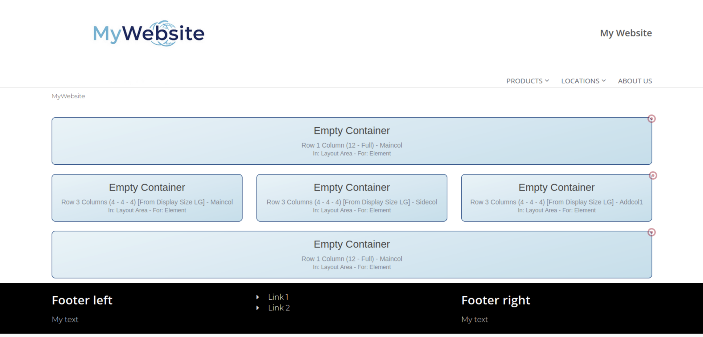
Your grid would look like this:
- Row 1: 1 column (12) → full-width image slider
- Row 2: 3 columns (4-4-4) → teaser boxes
- Row 3: 1 column (12) → full-width text block
This structure can easily be created using the predefined layout rows provided by Mercury.
Adding Layout Rows to a Page
Once you’ve created a page (via the Sitemap Editor), open it in the Page Editor to begin structuring the layout.
Steps:
- Click “Add Content” → “Template Elements”
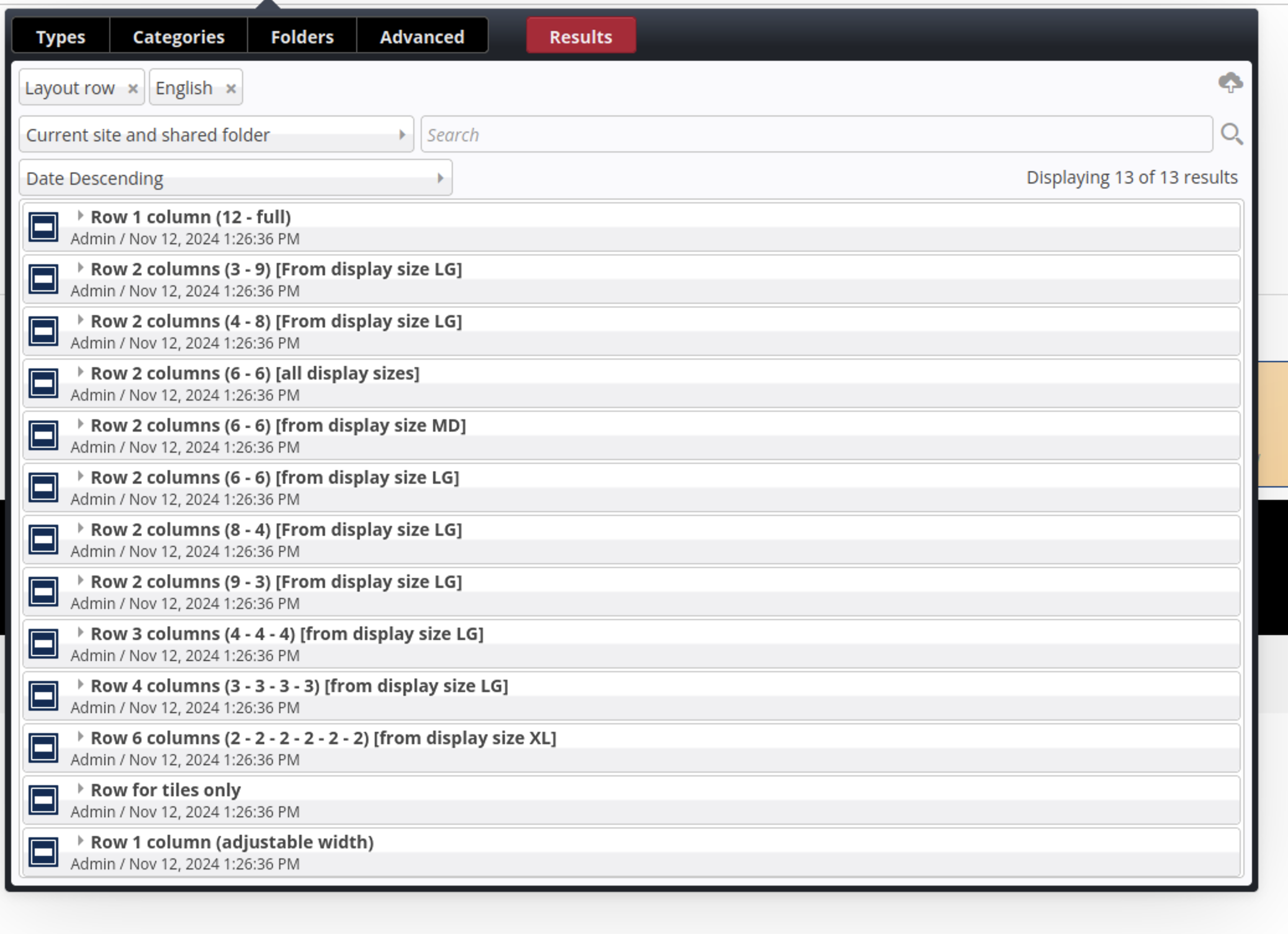
- Choose “Layout Row”
- Select from a list of predefined row layouts:
- Single column: 12
- Two columns: 6-6, 8-4, etc.
- Three columns: 4-4-4, 3-6-3, etc.
Each number corresponds to column widths from the Bootstrap grid (out of 12).
Note on Deleting Rows
If you delete a layout row, all content inside it will be removed from the page. However, the content itself will not be deleted from the system. Content elements still exist and can be reused in other rows again (or copied and modified). If needed, move the elements to a new row before deleting.
Adding Content to Layout Rows
After your layout rows are in place, you can start adding content:
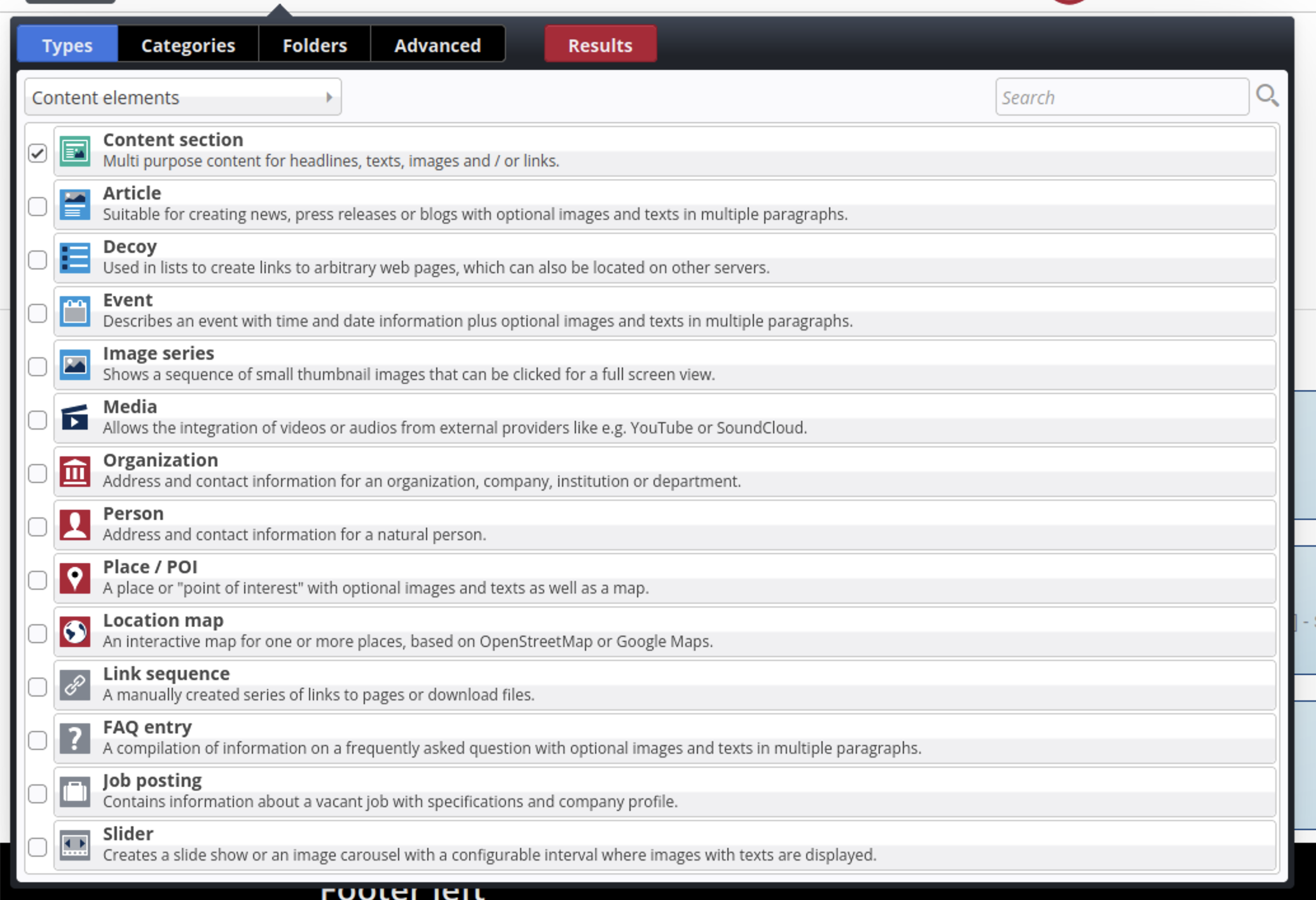
- Click “Add Content” → “Content Elements”
- Drag and drop elements such as:
- Text blocks
- Images
- Buttons
- Sliders
- Teasers
Content elements are placed into a column inside the layout row.
Reusing or Copying Content Elements
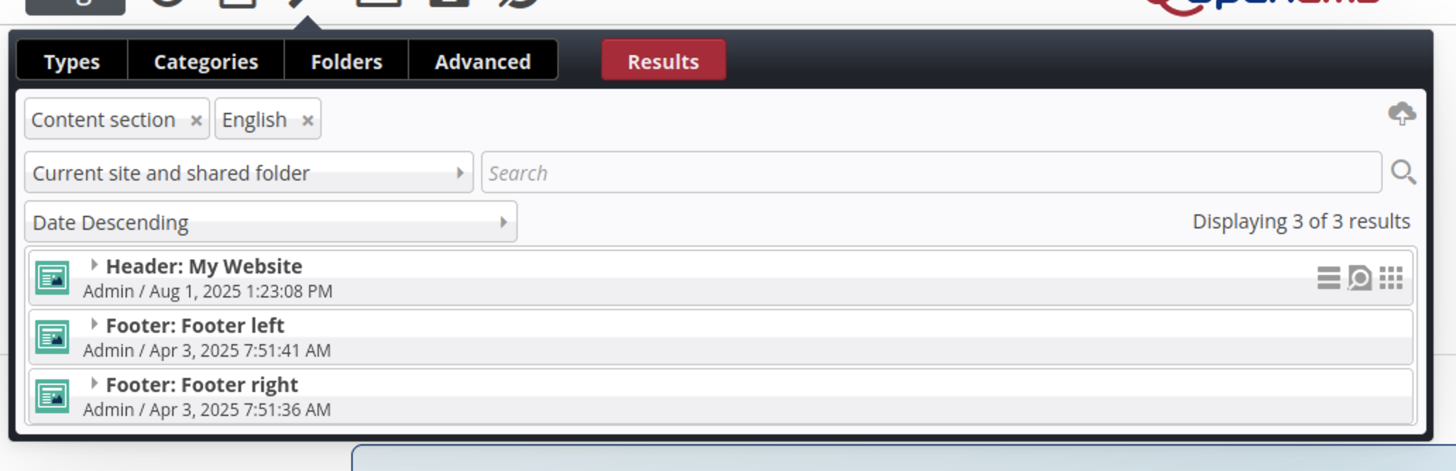
If you want to reuse or copy an existing content element:
- Click on the name of the content type. A list of all existing elements of this type will be shown (with filtering options).
- Use the “nine-dot” symbol to drag & drop them onto your page.
- If you press Control while dragging, the system will ask if you want to reuse the element or create a copy of it.
Optional: Predefine Grid Layouts in Template Models
If you often reuse the same page structure, you can define layout rows directly in a template-model.
This means:
- All pages created with this model will automatically include the predefined layout.
- You can create multiple template-models, each with different row structures (e.g., for blogs, landing pages, product pages).